Calling all graphic designers: The 2020 Olympics need you
The bibs at the Olympics have been causing a stir on social media this week because of their inconsistency, odd font choice and bulkiness.
Congrats, Liu Hong (#CHN) on winning #gold in women's 20km race walk! #Athletics #Olympics pic.twitter.com/QQYXagyqpd
— Olympics (@Olympics) August 19, 2016
With aerodynamic uniforms aimed at reducing fractions of a second in a race, it’s strange to see unusually large race bibs at the Rio Olympics. The bibs, which display an athlete’s last name, are wore on the front of an athlete’s singlet during races.
It’s safe to say that the bibs need a little bit of work, both in the spell check department and in regards to consistency.
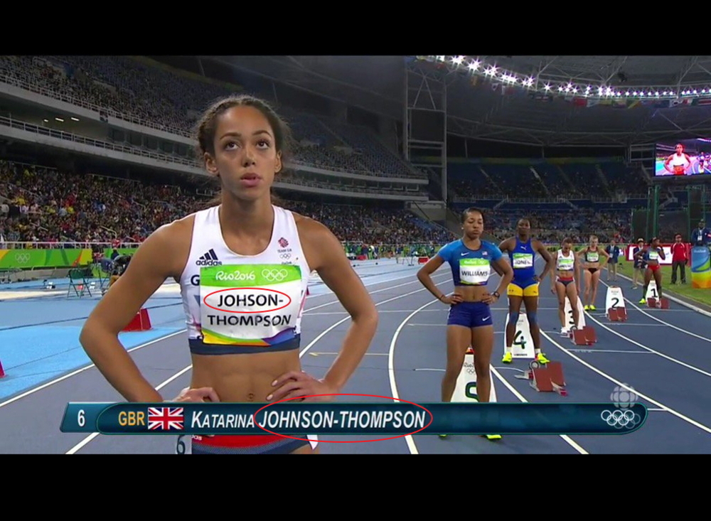
Katarina Johnson-Thompson had to wear a misspelled bib for the opening day of the women’s heptathlon. Fortunately, she received a revised version on the second of two days in the seven-discipline event. Someone forgot the “n.”
The typo was just the first in a number of photos captured during the Olympics where athletes are seen wearing bibs with different fonts in varying size. For shorter names, the gap between letters is huge rather than the name being centered and the letters condensed.
RELATED: VIDEO: 400m runner dives across the line to win Olympic gold.
The topic has seen an uptick in popularity recently thanks to a Twitter campaign. The Rio bibs have been trending on the social media platform this week with the tag line “The bibs at Rio are the worst and it is not OK.”
RELATED: Photos: The best and worst track kits at the 2016 Rio Olympics.
There’s been a lack of consistency in the design of the bibs. In the men’s 3,000m steeplechase, for example, Ezekiel Kemboi had non-bolded print while Evan Jager and Hamid Ezzine had the bolded version.
Kemboi’s and Jager’s bibs side-by-side
First global medal for @EvanJager is a #Silver
Tenth global medal for Ezekiel Kemboi is a #Bronze#Rio2016 pic.twitter.com/VX05XnjgfE
— IAAF (@iaaforg) August 17, 2016
Kemboi’s and Ezzine’s bibs side-by-side
Forget the keirin, the bib fonts are the real shambles of #Rio2016 pic.twitter.com/q3llCDm6jM
— Gareth Price (@G_Price) August 17, 2016
Twitter users are not too happy with the design choices
The bibs for rio are trash
— PRE (@Stopherschel) August 14, 2016
Honestly, these Rio #athletics bibs are such a trainwreck. Come on, @iaaforg. @sebcoe, don't let it happen in Tokyo!
— Don Whelan (@dvw2) August 16, 2016
The irregular fonts on these Rio bibs are really starting to get to me. Genuinely concerned that they'll start using Comic Sans by the end.
— Jon Mulkeen (@Statman_Jon) August 16, 2016
Most under reported story of #rio2016 #athletics. The random bib fonts, never know what you're going to get from session to session.
— Mathieu Gentès (@mat_gentes) August 16, 2016
I'm pretty sure these Rio track bibs were just printed by some dude on the office inkjet
— Richard (@arrpeeoh) August 14, 2016
I don't understand why the letters on bibs are different sizes at Rio.
— Thayne Griffin (@thayne_griffin) August 15, 2016
Three- and four-lettered last names are some of the strangest looking
1 It's more than a job
2 Fight for it
3 Make the details countMatej Toth's guide to #goldhttps://t.co/3jikHqIFey pic.twitter.com/temizXhion
— SPIKES (@spikesmag) August 19, 2016
Canadians Sage Watson and Noelle Montcalm got the bold print
Andre De Grasse’s bib in the men’s 100m heats
De Grasse’s bib in the men’s 100m final
The Rio bibs come after Nike used redesigned name plates at the Prefontaine Classic in Eugene, Ore. The bibs, known as AeroSwift Bibs, do not require safety pins and instead adhere to clothing. Perhaps, newer designs will be seen at the 2020 Tokyo Olympics the next time around.
Check out the latest buyer's guide: