Athletics Canada’s new logo: excellent or ambiguous?
Athletics Canada, the governing body for track and field, road running and cross-country, has decided that it is time for a change.
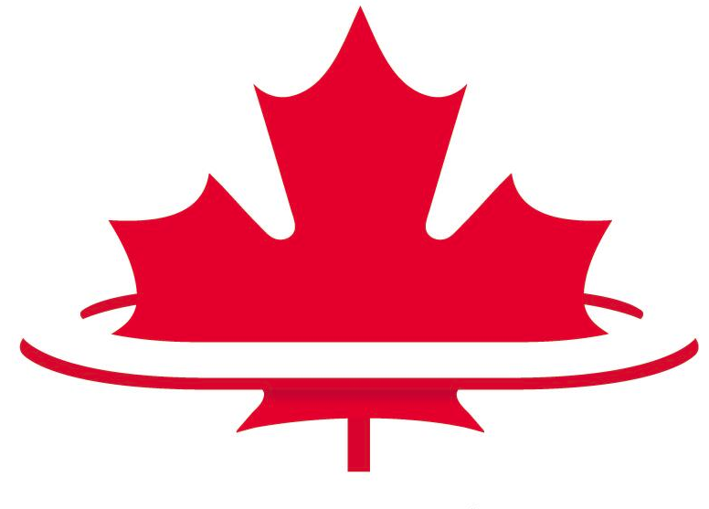
The organization tweeted an image this morning of a possible new logo.
Potential new Athletics Canada logo??? RT if you like the concept. pic.twitter.com/XBNFZaFhtt
— Athletics Canada (@AthleticsCanada) June 3, 2014
![]() The current logo, which features the figure of an athlete in motion in front of a half maple leaf, may not be around much longer. The proposed logo is more ambiguous in terms of what it is depicting.
The current logo, which features the figure of an athlete in motion in front of a half maple leaf, may not be around much longer. The proposed logo is more ambiguous in terms of what it is depicting.
So obviously we here at Canadian Running spent some time brainstorming what the new logo may represent. Is it a track that surrounds the maple leaf? Is it the maple leaf rising out of a stadium? Is there no longer a human figure so that there is gender equality (the previous figure had a male body shape)? What was the thought behind switching from a half maple leaf to a full?
With no definitive answers agreed upon, we’re throwing the question out to you. What do you think the prospective Athletics Canada logo represents?
Check out the latest buyer's guide: