Mixed reactions to Boston Marathon apparel
 The Boston Marathon apparel was unveiled this week to mixed reactions from runners intending to race the event.
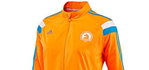
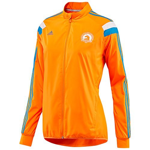
Reviewers seemed upset with the choice of colour and design change on the new Celebration jackets, the iconic Boston Marathon jackets that runners have come to associate with the event. Some were also upset with a perceived lack of quality.
“Not only is it the ugliest hazmat suit, traffic cone colour I’ve ever seen in my entire life, but did you really have to remove the flap in the back? It doesn’t even resemble a Celebration jacket. I shed tears the first time I saw it because I was so sad.”
Many felt in a year after the bombings in 2013 that the apparel should have had a more patriotic feel, and that the colours don’t reflect the gravity that the event will have beyond the running community in 2014. Alternate ideas included a red, white and blue colour scheme or a return to the classic blue and yellow Boston Athletic Association colours.
The colour scheme is also the same one as the 2013 New York City Marathon.
“I am relatively new to running and 2014 will be my first Boston Marathon. I have many friends who proudly wear their Boston jackets from years past and I was so excited to join the club and have my own, but the colour and design are so disappointing that I may not buy this jacket, even though I desperately want one.”
Some people do like the new jackets and are excited about the orange designs, but an overwhelming number seemed to be at least slightly disappointed in the colour scheme of the new apparel and the move away from a ventilated back on the jackets, which has been standard in previous years.
Adidas had a chance to do something powerful with upcoming Boston Marathon celebration jacket. Don’t think they did pic.twitter.com/bdus8I4i5l
— darren rovell (@darrenrovell) January 14, 2014
Check out the latest buyer's guide: