A year of running in a single, mindblowing photo
A cool way of displaying 365 days of running
There’s a lot of different ways you can extrapolate running data.
From heat maps to aerial views to simulations (Strava Flybys), GPS data, often through Strava, offers a number of different ways to visualize data. How about a year of runs condensed into a single photo?
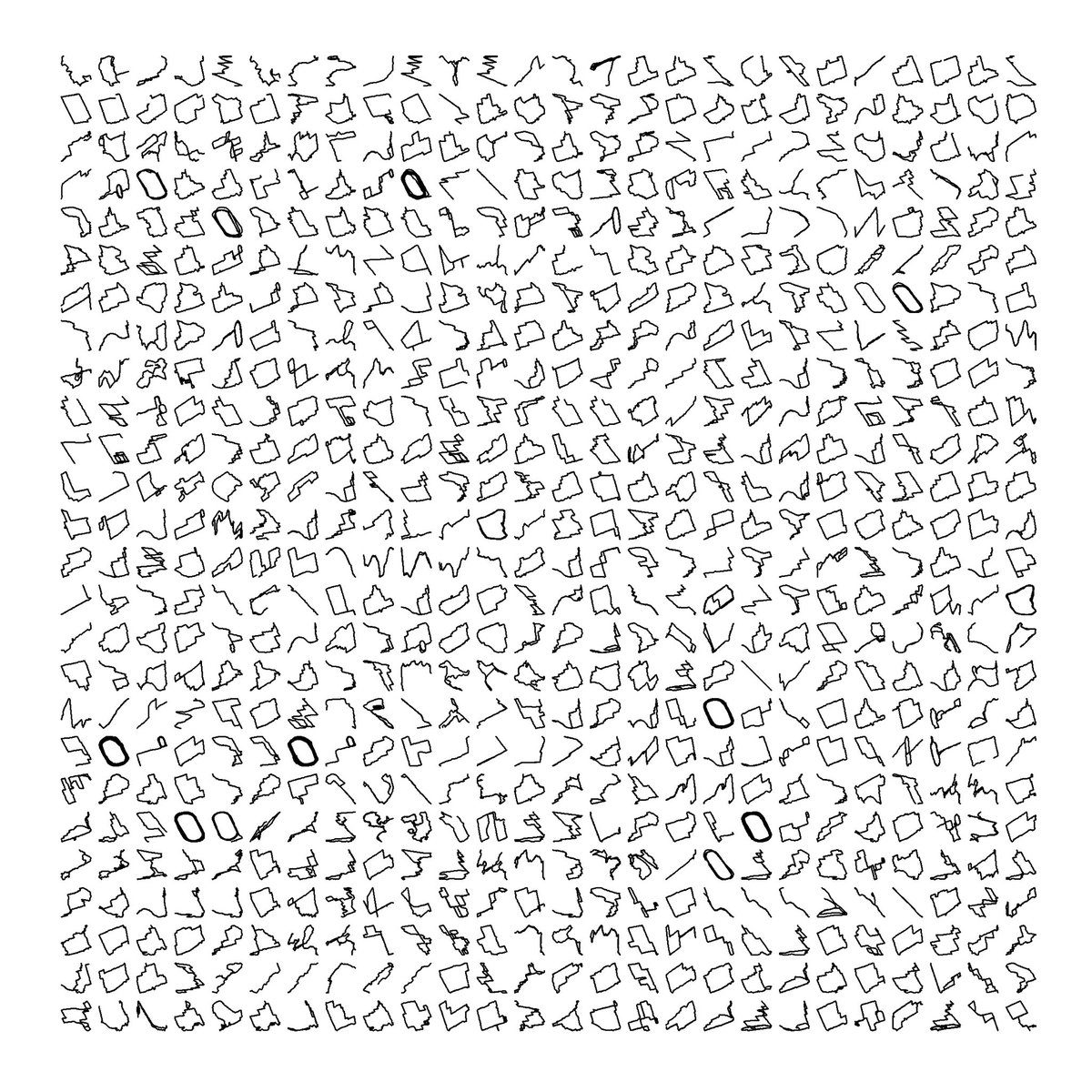
In what first appears to be a mash of random designs, or even hieroglyphs for that matter, one photo is able to encapsulate an entire year of training through each run’s individual outline. Can you spot the track workouts?
The outline of all my runs in 2017 @Strava
h/t @MattHuebsch pic.twitter.com/zR7MgfLgUA
— Tim Huebsch (@HuebyT) January 3, 2018
Can you tell what city the runs are done in? (Note that this map is created entirely from GPS run data.)
In map form pic.twitter.com/GfZmsWKaLq
— Tim Huebsch (@HuebyT) January 3, 2018
Marcus Volz is credited with originally posting about the run icons on Twitter.
Check out the latest buyer's guide: