Athletics Canada rebrands with new logo, ‘cutting-edge’ identity
Pulling from the maple leaf, the track, the podium and the Olympic torch, AC's logo has a fresh new look
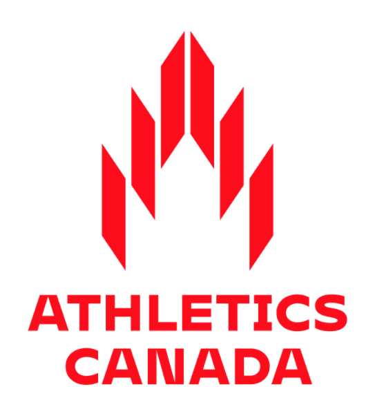 Photo by:
Athletics Canada
Photo by:
Athletics Canada
Athletics Canada (AC) has unveiled a new logo ahead of the Tokyo Olympic and Paralympic Games. The sharp, sleek and “cutting-edge” logo is a big change from the organization’s previous emblem, which featured a maple leaf surrounded by a track. The brand is now represented by a symbol that AC says draws from “our sport, our country and our bright future.”
The time is now. Athletics Canada launches a new brand identity for us all to rally behind. Get your first look…now! #TheTimeIsNow https://t.co/wvl33k2FjP pic.twitter.com/eM0lhi1Ouq
— Athletics Canada (@AthleticsCanada) March 24, 2021
Finding a new brand
“Athletics Canada represents athletes from a lot of different disciplines, so we needed to create an identity that represents everyone and unifies them into one powerful team,” said AC CEO David Bedford. “From high school athletes to national team members, this brand represents all of us.”
RELATED: Athletics Canada launches nine-meet series for Olympic and Paralympic hopefuls
Instead of going about the process of rebranding on its own, AC enlisted the help of the organization’s “most invested stakeholder groups: the athletes themselves.” The team at AC wanted its new identity to encompass all disciplines of athletics — from track and field to para athletics, mountain running and everything in between — and this change represents the diverse spectrum of athletics in Canada.
“A lot of athletes are hungry and eager to compete after having our seasons cut short in 2020,” Aaron Brown, Olympic and world championship sprinting medallist, told AC. “This new Athletics Canada rebrand reflects that, letting the world know that the team is ready to come out of the gate with fire and pride when representing the maple leaf.”
Inside the logo
As AC has pointed out, the logo is more than just a cool new look, and the final product incorporates several images into its design. First, there’s the maple leaf, which can be seen in the logo’s negative space. This represents the country’s athletes and fans that AC supports.
Next up is the track, as the logo’s broad lines form lanes, and their sharp angles suggest movement and speed. The logo draws on a podium as well, with its tiered shape representing the steps every athlete hopes to climb one day.
RELATED: Athletics Canada updates format for the Canadian Olympic Trials
Finally, there’s the Olympic torch, which AC calls “a symbol of the pursuit of perfection, enlightenment, passion and hope.” This one’s a bit more difficult to see, but if you trace a curvy line around the logo’s sharp edges, you’ll see the torch’s flame. AC also points out that the logo “reflects the shape of the letter ‘A,'” which of course stands for “Athletics.”
The logo was only just released, and while many people have yet to broadcast their opinion on the change, AC reached out to several Canadian athletes to get their takes.
https://www.instagram.com/p/CMzrKDtghFV/?utm_source=ig_web_copy_link
Paralympic sprinter Marissa Papaconstantinou said AC’s new look is “edgy and sleek, which I think represents the sport of track and field.” Sage Watson, the Pan Am Games 400m hurdle gold medallist and a 2016 Olympian, said she loves the new logo, adding that she believes it’s “important that we represent all disciplines and all levels of athletes, and I feel like this logo does that exactly.”
To learn more about AC’s new look and brand identity, click here.
Check out the latest buyer's guide: